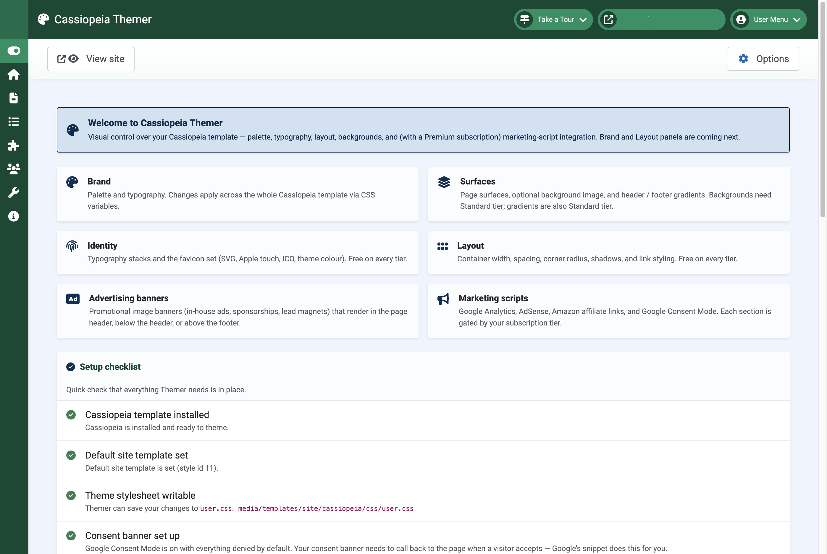
What Cassiopeia Themer does
Cassiopeia is the front-end template that ships with Joomla 5 and 6. It has plenty of options buried under Site Templates → Cassiopeia, but rebranding it to look like your site usually means writing CSS, and that’s a barrier for site owners who’d rather click than code.
Cassiopeia Themer adds an admin component (com_themer) that turns those choices into colour pickers, sliders, and toggles. Every save writes a single file at media/templates/site/cassiopeia/css/user.css — the file Joomla loads after Cassiopeia’s own stylesheet — so your settings cleanly override the defaults without you ever editing template files.
It also ships a system plugin that injects the things CSS can’t do alone: favicon links, banner blocks, Google Analytics, Google AdSense, Google Consent Mode, and Amazon affiliate-link rewriting.
Themer is open-source under the GNU General Public License v3 (GPL-3.0-or-later) and works on Joomla 5.x and 6.x.
Install
Download the pkg_themer ZIP from the extension page, then in your Joomla admin: Extensions → Manage → Install → Upload Package File. Drop the ZIP. After install, you’ll find Cassiopeia Themer under Components.
The first time you open it, the dashboard runs a setup checklist:
- Cassiopeia is installed (it ships with Joomla, so this is almost always green).
- A default Cassiopeia style exists.
media/templates/site/cassiopeia/css/user.cssis writable by the web server.
If user.css isn’t writable, fix file permissions on the media/templates/site/cassiopeia/css/ directory before going further. Themer can’t apply any change without write access there.
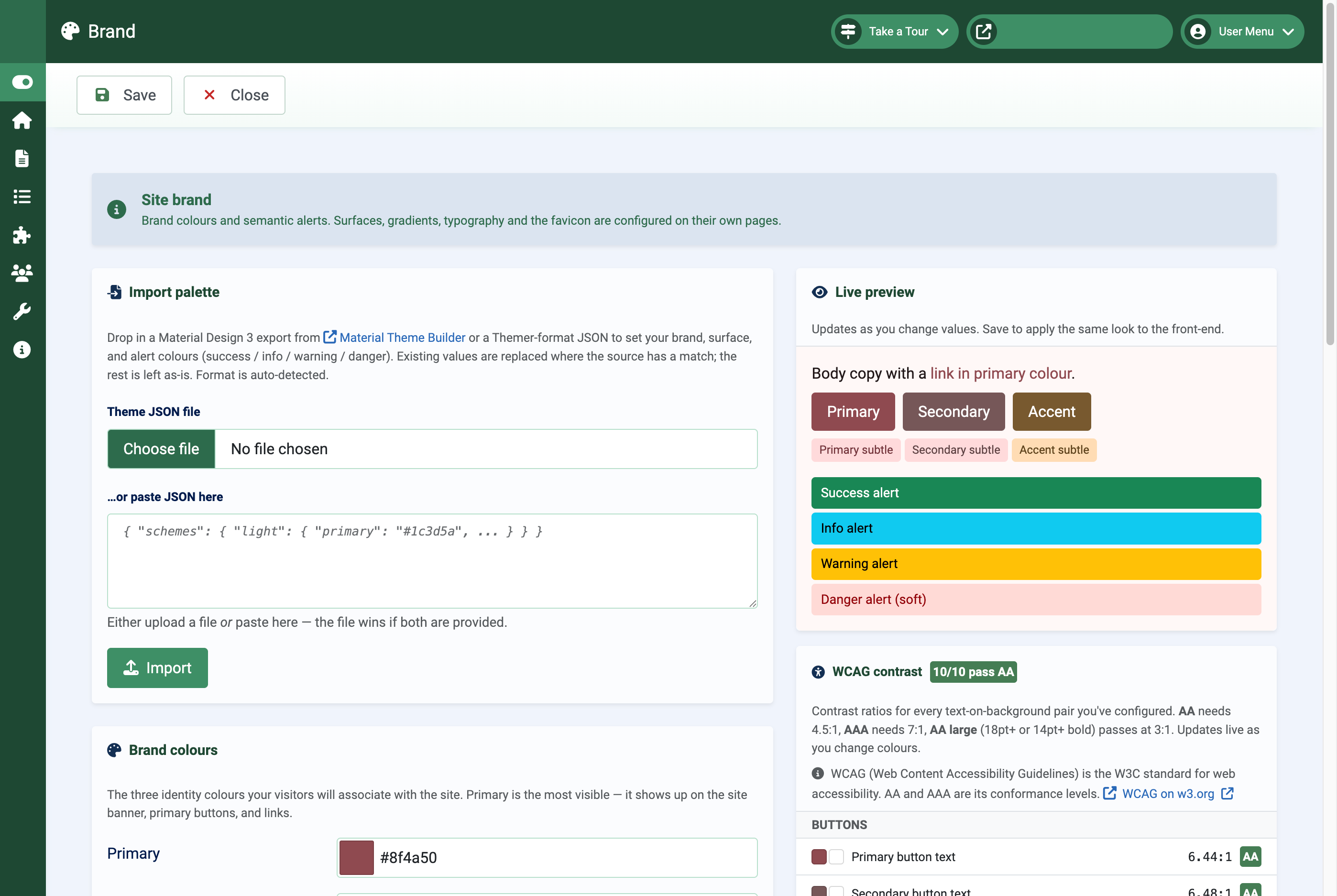
Set your brand colours
Open Cassiopeia Themer → Brand. There are three groups of colours:
- Brand — primary, secondary, and accent. Each colour has a paired text colour for things sitting on top of it (e.g. button labels), plus a container variant for the soft / subtle background tints Bootstrap uses on alerts and pills.
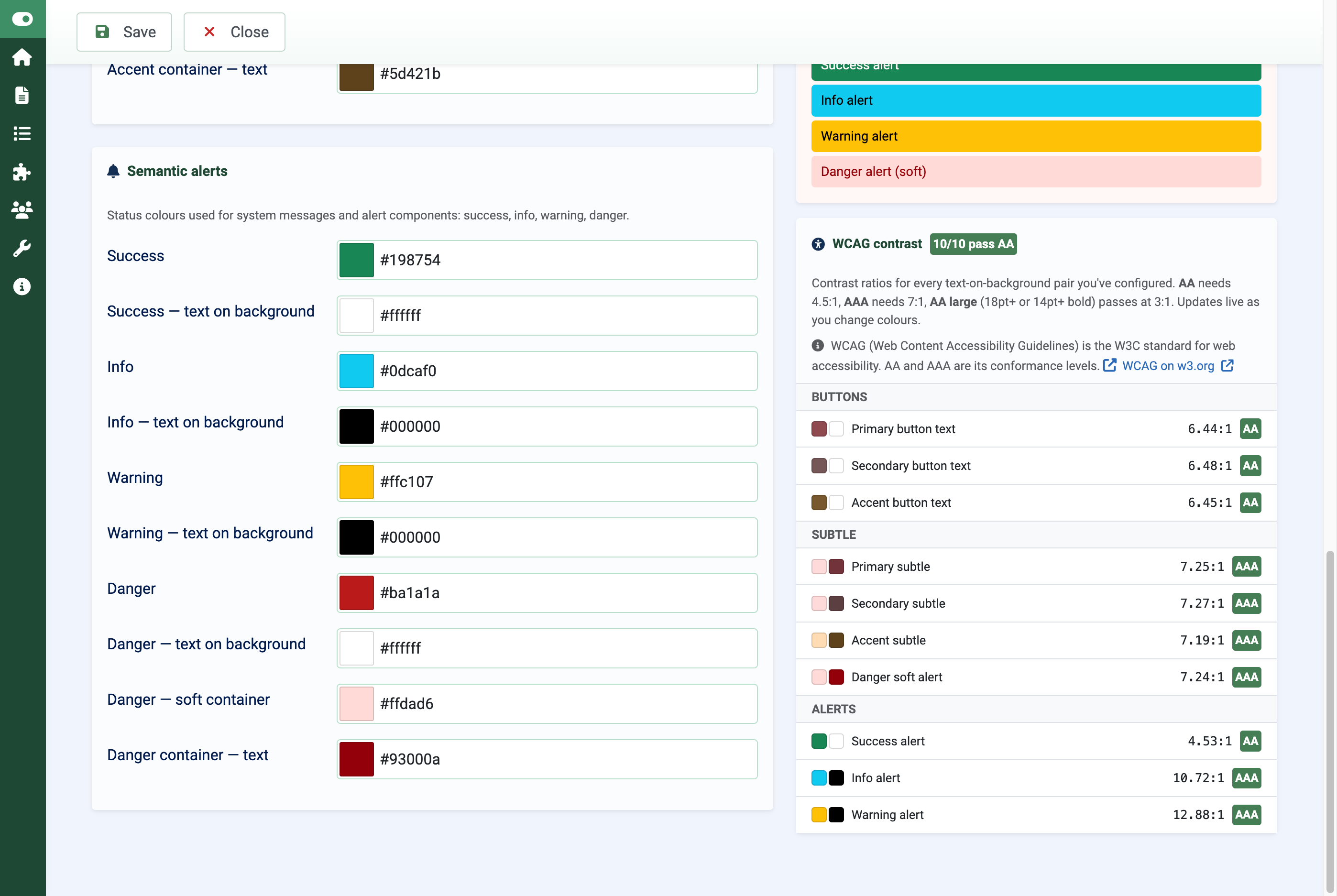
- Semantic — success, info, warning, danger. Same idea: the colour itself plus the readable text on it.
The right-hand pane shows a live preview that updates as you type, with buttons, links, badges, and alert blocks rendered in the colours you’re picking. Below the preview, a WCAG contrast checker grades each colour pair against the AA (4.5:1) and AAA (7:1) thresholds. Pairs that fail at any size light up red, so you catch invisible button text before publishing.
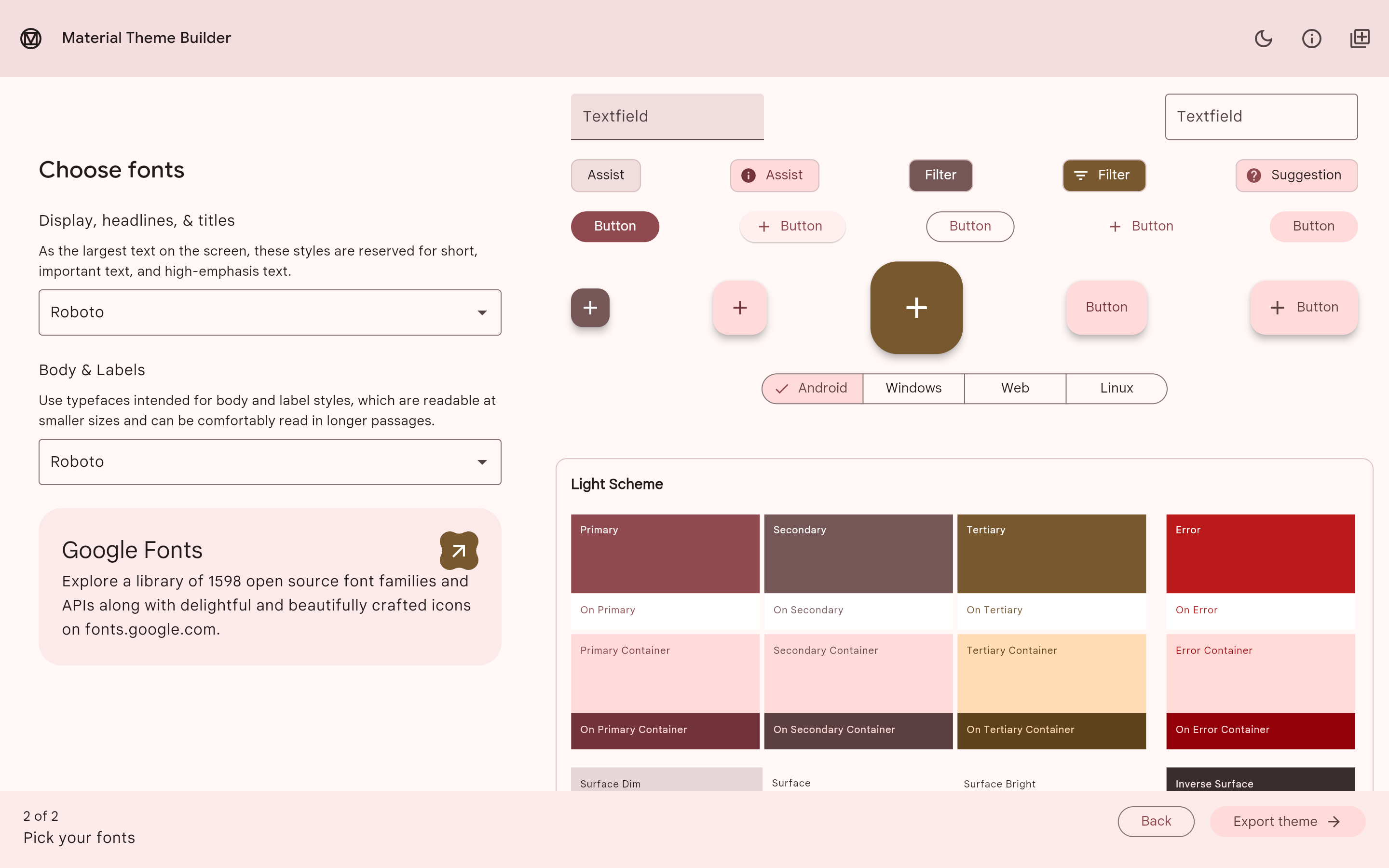
If you already have a Material Theme Builder palette (e.g. from material-foundation.github.io), the Import card at the top of Brand accepts the JSON export — upload or paste — and maps the Material 3 tokens onto Themer fields in one click. Saved palettes can be exported back out to JSON on Standard tier and above.
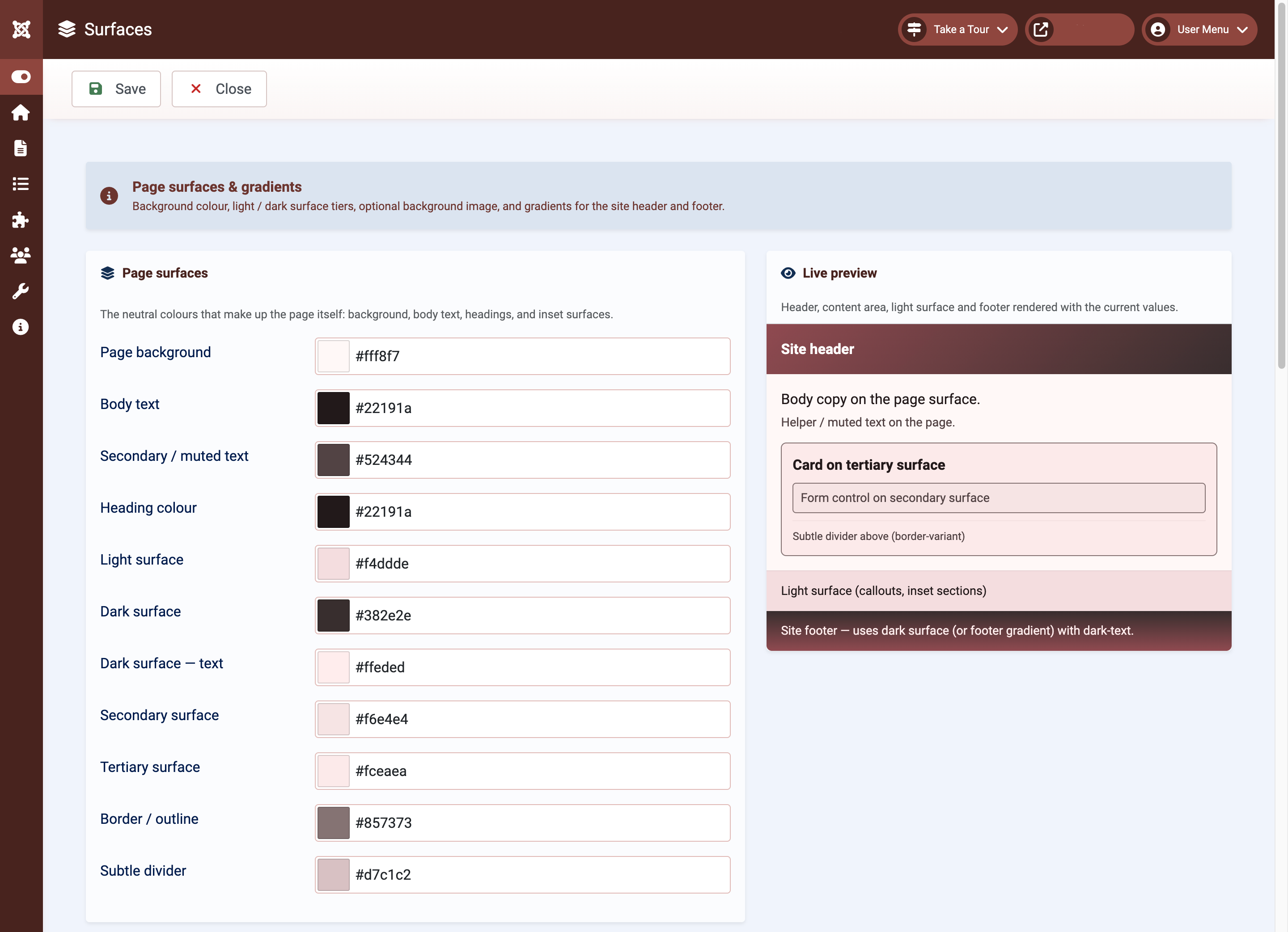
Surfaces, backgrounds, gradients
Open Cassiopeia Themer → Surfaces. This is where the structural colours of the page live: the page background, body text, secondary and tertiary surfaces (cards and inset blocks), the dark panel colour, borders.
Setting any of these surface fields automatically propagates to the matching Bootstrap component — cards, modals, dropdowns, accordions, pagination, list groups, form controls, nav tabs, offcanvas drawers, toasts, popovers, breadcrumbs. Out of the box those components consume their own CSS variables (--bs-card-bg etc.) which don’t inherit from the page surfaces, so a warm-palette site used to end up with cool-grey accordions and dropdowns regardless of how Brand and Surfaces were configured. Themer now writes a derived component-variable mapping so they all follow the configured palette automatically.
Three optional component-level controls live alongside the colour pickers:
- Card hover effect — none / lift / glow / scale. Targets cards with
.shadow-smor.shadow. Default none. - Accordion style — Default (separated) is Bootstrap’s stock pill-button look. Continuous stack strips the per-button border and box-shadow so adjacent buttons share an edge with the item border doing the visual work — the layout most modern design systems prefer. Cards spaces each item out with its own rounded border.
- Tint accordion active state — when on, an open accordion item’s header takes the Light surface colour with the Heading colour as foreground, matching Bootstrap’s idiomatic tinted-background pattern. Composes on top of any layout style.
Two extras gated for paid tiers:
- Background image — pick a hero or pattern image to sit behind the page background colour. Choose a position (top / centre / cover / contain), opacity, and whether it tiles or scales.
- Header / footer gradients — replace the solid header and footer with a two-colour gradient. Click any of the eight preset swatches (Multizone, Sunset, Ocean, Aurora, Forest, Slate, Rose, Citrus) to fill the picker. Click for the header, Shift+click for the footer. Pick linear or radial.
The live preview on this page renders a chrome-style mock: header band on top with the configured gradient, page area in the middle (with a card and form control on the secondary surface), light surface band, and the dark footer, plus mini accordion-stack / pagination / dropdown blocks so the component-level effects are visible without leaving the form. Useful for checking that text on dark surfaces stays readable.
Choosing gradient colours
Gradients give the site a more polished, modern feel, but the colour pair matters more than you’d think. The eight bundled presets (Multizone, Sunset, Ocean, Aurora, Forest, Slate, Rose, Citrus) are designed to be safe out of the box, but you’ll often get a better result picking from your own palette so the gradient harmonises with everything else on the page.
Header recipes — the header sits at the top of the page and wants brand presence. Try:
- Primary → Dark surface, direction diagonal top-left to bottom-right. Energetic, Bootstrap-docs feel. The dark end always grounds the gradient so white text stays legible all the way across; works on any palette.
- Primary → Primary — text on background, diagonal top-left to bottom-right. Subtle two-shade brand strip. Useful when your Primary text colour is itself coloured (e.g. a navy palette with a pale-blue text-on-primary) rather than pure white.
- Primary → Secondary, diagonal top-left to bottom-right. Only when both share a hue family — warm reds with warm greys works, red Primary with green Secondary doesn’t.
Footer recipes — the footer is calmer and doesn’t need brand presence. Try:
- Dark surface → Primary, direction top to bottom. Anchors the page on near-black, brand colour peeks through at the bottom edge.
- Dark surface → Secondary, top to bottom. Gentler if your Secondary is muted — reads as a textured matte.
- Dark surface → Body text, top to bottom. Effectively a soft vignette — the most professional, least busy choice.
Avoid
- The three soft container swatches (Primary / Secondary / Accent — soft container) on the header. They’re meant for body content tints (alert backgrounds, badges) and look washed out behind white text.
- Primary → Accent unless you’ve deliberately picked Accent to harmonise. The default Accent is yellow against a coloured Primary — they’ll fight.
- Pairings that cross warm and cool hues (red ↔ blue, orange ↔ green).
- Light surface at either end — too pale to support white text on the header, too pale to ground the footer.
Direction quick-pick
- Diagonal top-left to bottom-right — energetic, dynamic. Default choice for headers.
- Diagonal bottom-left to top-right — same energy, but the lighter end sits at the top. Useful when you want the brighter colour above the menu.
- Left to right — horizontal brand-strip aesthetic.
- Top to bottom — calmer and more professional, especially for footers.
- Radial from centre — spotlight effect. Sparingly, and only on a feature header.
Readability check before saving. Open Brand and glance at the contrast list: Primary → Primary — text on background. If that pair shows AA or better (≥ 4.5:1), the lighter end of your header gradient is safe for white text too. The dark end always passes.
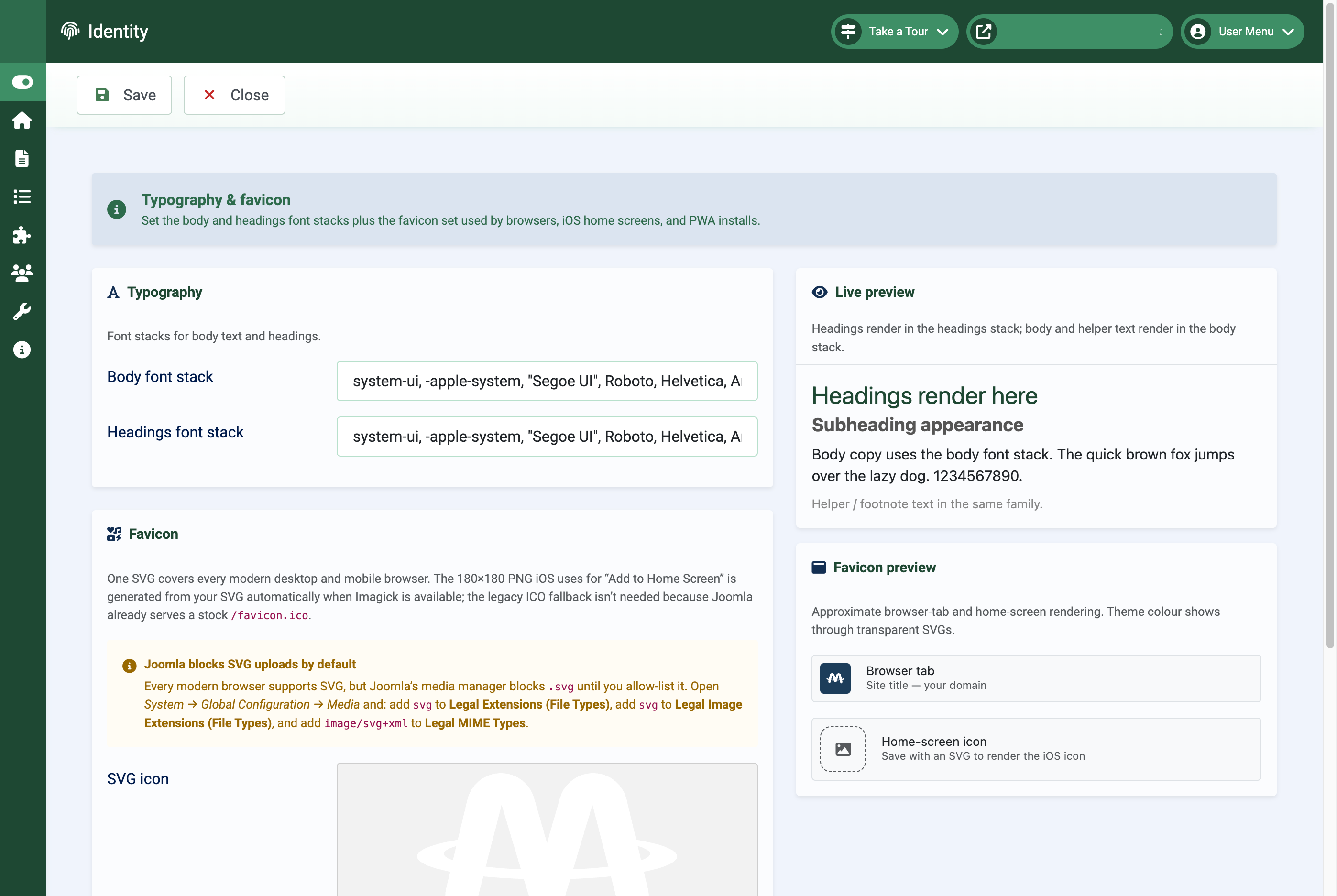
Typography and favicon
Open Cassiopeia Themer → Identity. Two things here:
- Typography — pick a CSS font-family stack for body copy and another for headings. The defaults are the modern
system-uistack which gives every visitor whatever their OS uses (San Francisco on Mac, Segoe UI on Windows, Roboto on Android), but you can paste in a Google Fonts stack if you’d rather. Article reading rhythm picks the vertical rhythm inside Joomla content articles: default uses Bootstrap defaults, compact tightens heading top-margins and body line-height, relaxed widens both for long-form reading. Applies to.com-content-article__bodyonly — module content stays unchanged. The preview on the right shows headings, body copy, and helper text in your stacks. - Favicon — one SVG covers every modern desktop and mobile browser. Themer also generates a 180×180 PNG automatically (rendered from your SVG, on a canvas in your theme colour, with proportional padding) for the icon iOS uses when a visitor adds your site to their home screen. Set the “theme colour” field below the SVG to control both the iOS canvas and the address-bar tint on Android Chrome / iOS Safari. The live mockup shows roughly what the browser tab and home-screen icon will look like.
Tip: the iOS PNG is regenerated every time you save Identity. If the “auto-generated” badge stays yellow saying Imagick isn’t available, ask your host to enable the php-imagick extension. iOS will fall back to a screenshot of the page otherwise — not pretty, but not broken either.
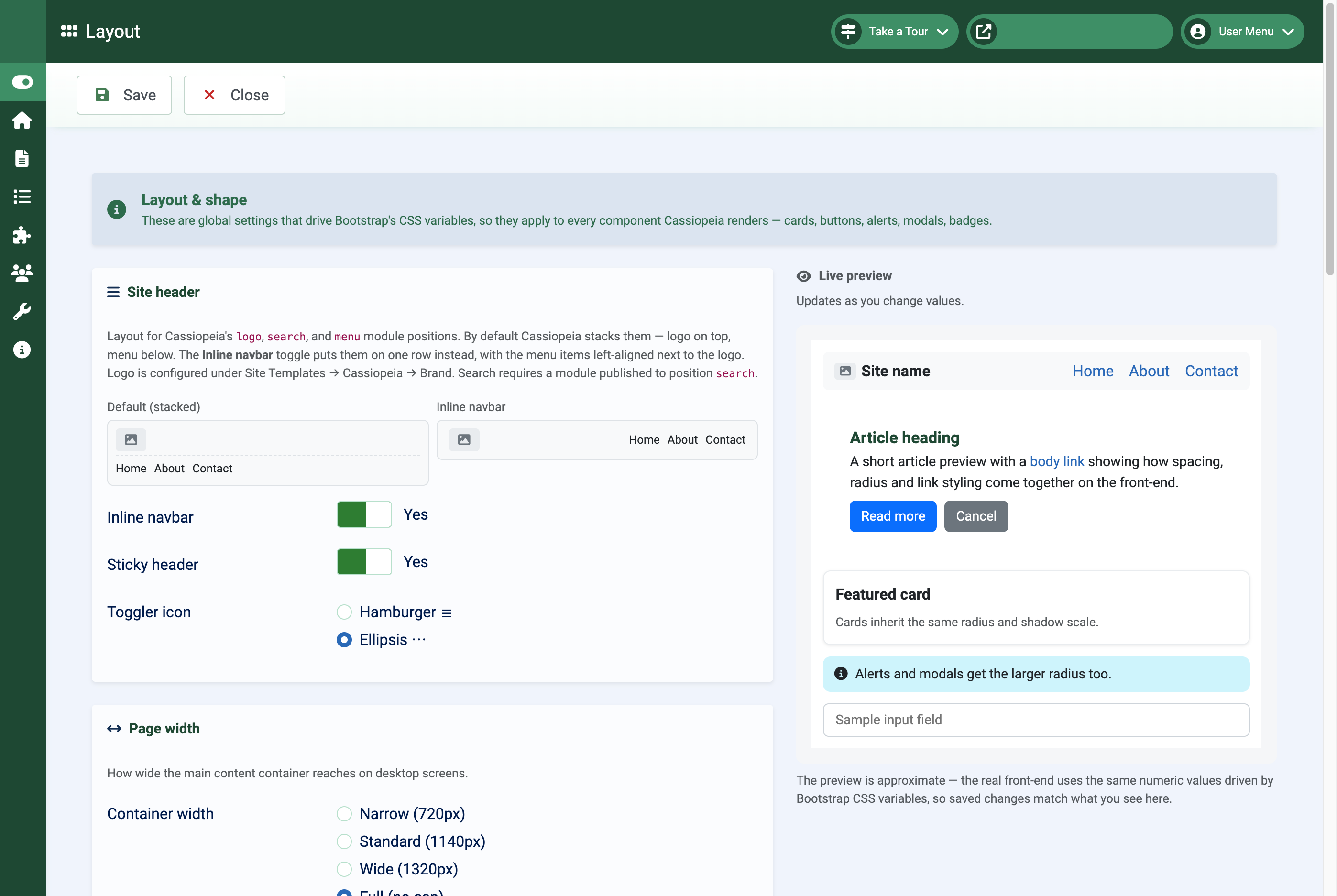
Layout: container, spacing, navbar
Open Cassiopeia Themer → Layout. This is the structural toolbox.
Container width picks the maximum width of the main content column (narrow / standard / wide / full). Spacing tightens or loosens the vertical rhythm of articles and main content. Shape picks the corner radius (sharp / rounded / pill) and shadow scale (flat / subtle / pronounced) shared across buttons, cards, alerts, and modals. Links chooses when underlines appear: always, hover only, or never.
The most-asked-for option lives in the new Site header card:
- Inline navbar — lays the logo, optional search, and main menu out side-by-side in one horizontal band like the Bootstrap docs site, instead of Cassiopeia’s default stacked grid. Logo on the left, menu items left-aligned right next to it. When the menu has more items than fit on one row, items wrap onto a new row at the left edge rather than spilling off the screen or bumping into the logo.
- Sticky header — pin the header to the top of the viewport when the visitor scrolls, with a subtle backdrop blur and shadow so content underneath stays readable. Available only when Inline navbar is on.
- Toggler icon — pick the icon for the mobile menu button (visible below 992 px wide). Hamburger ☰ or ellipsis ⋯.
To get the full Bootstrap-docs look, two preconditions outside Themer:
- Site Templates → Cassiopeia → Brand: upload your logo and set the site title. (Cassiopeia has its own “brand” settings here, separate from Themer.)
- Extensions → Modules: publish a search module —
mod_finderworks well — to positionsearchif you want a search box in the header. Themer’s inline navbar layout reserves up to 32 rem (≈ 512 px) for it between the logo and the menu.
The Front-end assets card sits below the Site header card. Bootstrap Icons is a single toggle that loads the official Bootstrap Icons CDN bundle so any <i class="bi bi-X"> in your content renders. Cassiopeia ships icomoon and Font Awesome but not Bootstrap Icons; this is the missing piece. Heads-up: Bootstrap Icons needs both classes — bi for the font-family and bi-X for the specific glyph. Joomla menu items’ Link Icon Class field is free text, so bi-person-circle on its own renders blank; use bi bi-person-circle.
The Menu polish card absorbs a cluster of mod_menu rough edges that otherwise need hand-rolled user.css. Four settings:
- Parent-item indicator — the glyph next to a parent menu item that signals it has children. Default is Cassiopeia’s stock CSS triangle (chunky and prone to wrapping). Chevron and Caret use Bootstrap Icons. None hides the indicator entirely. Picking chevron or caret depends on the Bootstrap Icons toggle being on so the font is loaded.
- Keep parent items inline — default on. Stops the indicator wrapping onto a second row when the menu label is long.
- Submenu background and Submenu text — an explicit colour pair for nested submenu lists. Cassiopeia leaves these unstyled which reads poorly when the parent menu sits on a coloured or gradient surface (typically the footer); level-2 items end up dark-on-dark. Leave both blank to keep Cassiopeia’s defaults.
The Layout preview includes a small parent / open-submenu mock at the bottom that repaints live as you change any of the four fields.
If you want to apply a one-off tweak Themer doesn’t expose — menu padding, a sticky sidebar, hover effects on a specific block — the Custom CSS textarea at the bottom of Layout writes through verbatim into user.css after the generated block. It’s sanitised lightly against obvious injection but otherwise lets you do anything CSS lets you do.
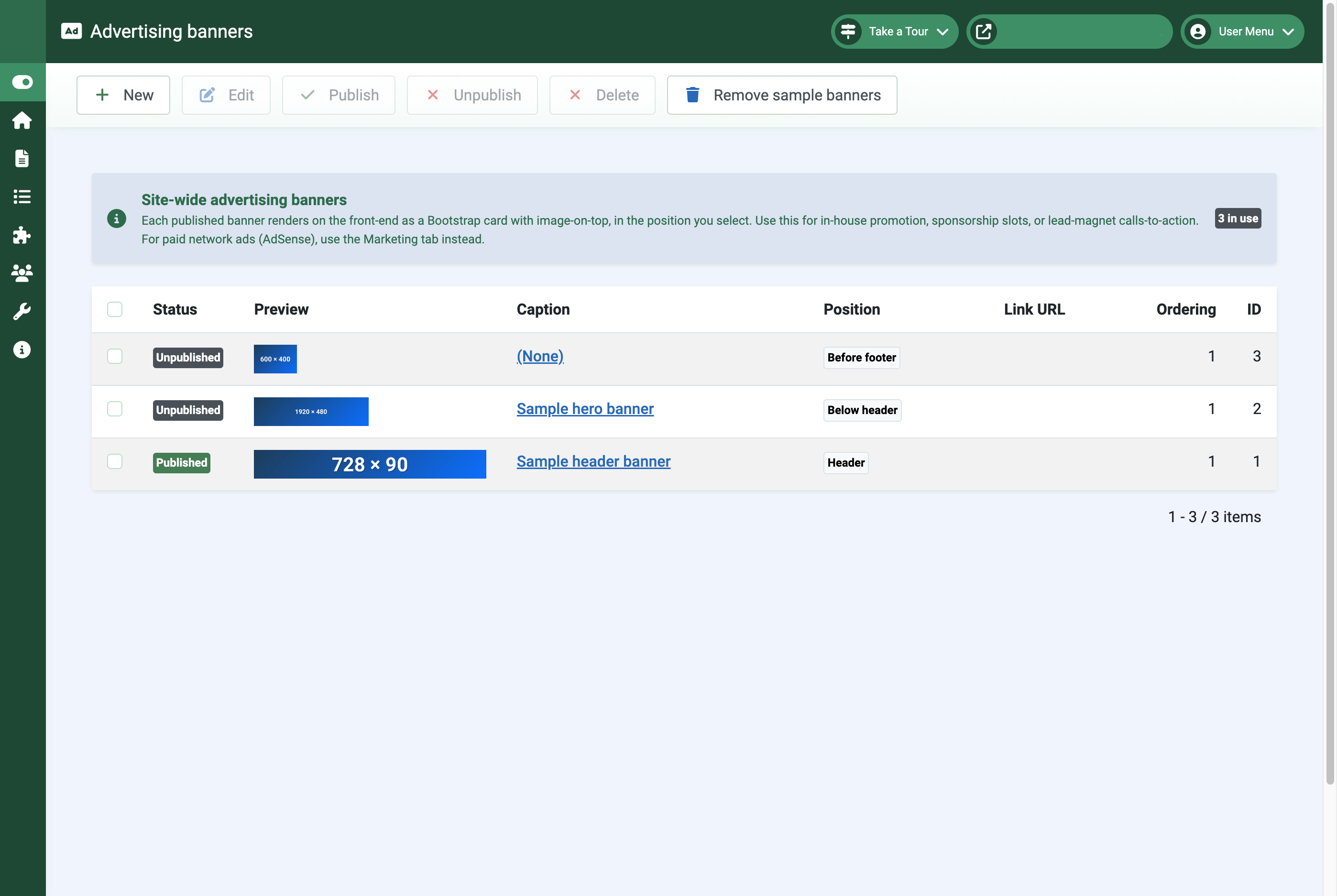
Banner slots
Open Cassiopeia Themer → Banners. Themer can render up to two banner slots on the trial tier, more on paid tiers, in three positions: header (above the menu), below-header (between the menu and the page), and before-footer.
Each banner can be one of two modes:
- Image — upload a PNG/JPG and a click-through URL. Width fits the container.
- Composed — build the banner from text fields: a gradient backdrop (two colours + direction), a headline, sub-head, call-to-action button, and an optional inline image. Useful for announcement strips that don’t need a full design pass through Photoshop.
Banners are unpublished by default (so they don’t suddenly appear on a fresh install). Open the row, fill in the fields, hit publish.
The first install seeds nine bundled placeholder PNGs as sample banners so you have something to look at and edit. They’re flagged as samples; you can leave them, customise them, or delete them.
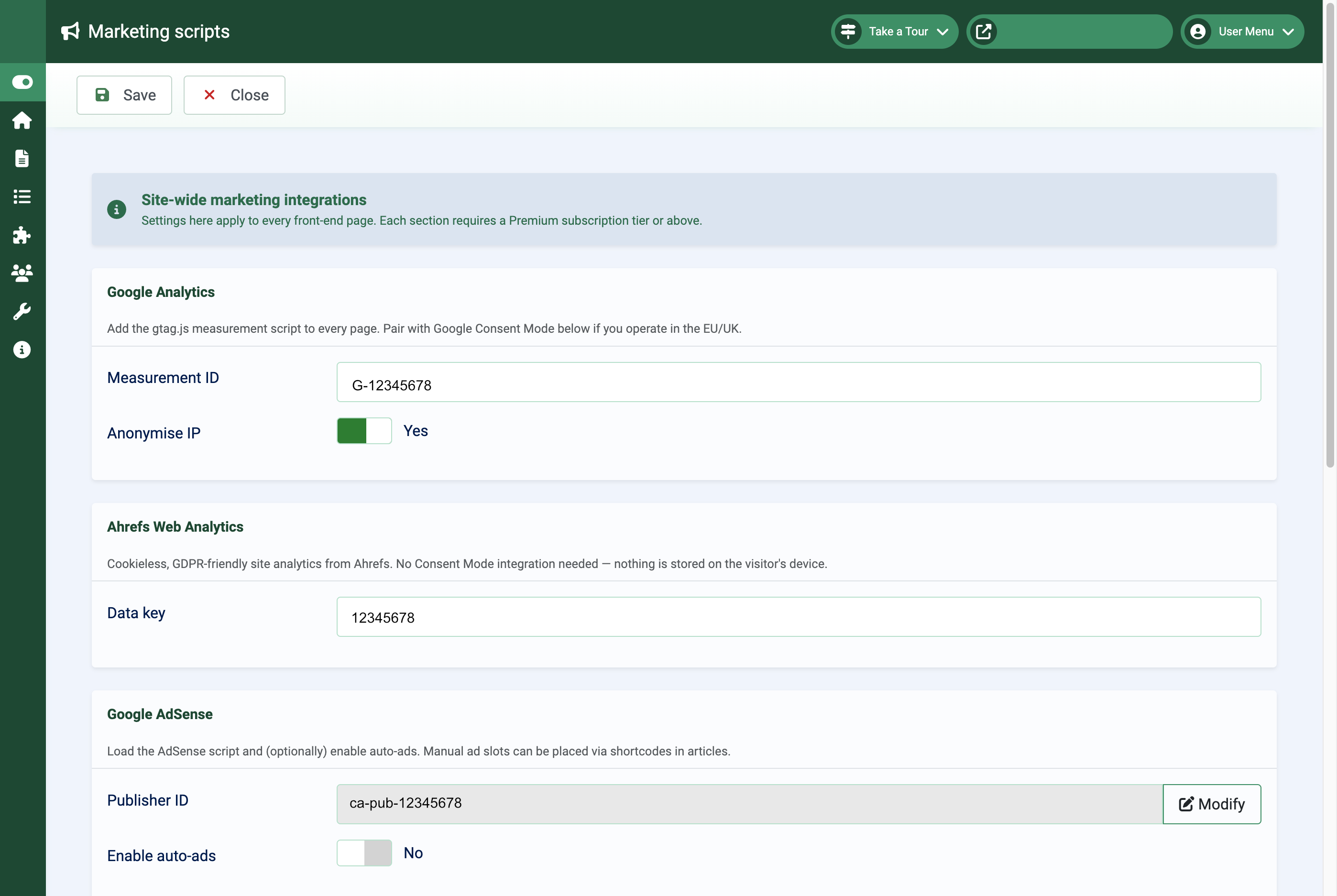
Marketing scripts and consent
Open Cassiopeia Themer → Marketing. The page is structured as opt-in cards, each gated by tier.
Standard tier adds:
- Ahrefs Web Analytics — cookieless web analytics. Paste in your
data-keyfrom the Ahrefs dashboard. No personal data collected, no consent banner required. - Amazon affiliate-link rewriting — provide your tracking ID per Amazon marketplace (
com,co.uk,ca,com.au, etc.) and a content plugin rewrites bareamazon.*URLs in your articles with the appropriate tag. Hover-confirmable in the link inspector before publishing.
Premium tier adds the heavier integrations:
- Google Analytics — paste in your measurement ID. The plugin emits the gtag bootstrap, with IP anonymisation enabled by default.
- Google AdSense — paste in your publisher ID. Auto-ads on by default; toggle off for manual slot placement only.
- Google Consent Mode — emits the default-denied stub before your Google Analytics / AdSense scripts so visitors’ consent decisions are respected. Optionally pulls in Google’s free Consent Management Platform — the page guides you through the AdSense Privacy & messaging setup with deep-links and a server-side test that fetches your front page and verifies the CMP loader and Consent Mode default reached the visitor.
The setup checklists on this page check more than just “you typed something in”: they validate IDs against expected formats, verify external accounts where possible (Amazon Associates Central, AdSense Privacy & messaging), and run an end-to-end test before declaring you done.
Tiers and what unlocks where
Cassiopeia Themer is freely downloadable. Every site can run it on the trial tier indefinitely.
| Feature | Trial | Standard | Premium | Enterprise |
|---|---|---|---|---|
| Brand, Surfaces, Identity, Layout (incl. Custom CSS) | ✓ | ✓ | ✓ | ✓ |
| Page background image | ✓ | ✓ | ✓ | ✓ |
| Header / footer gradients | ✓ | ✓ | ✓ | ✓ |
| Banner slots | ✓ (max 2) | ✓ (max 5) | ✓ (max 20) | ✓ (∞) |
| Front-end CSS / JS bundles | ✓ | ✓ | ✓ | ✓ |
| Bootstrap Icons toggle | ✓ | ✓ | ✓ | ✓ |
| Inline navbar layout, sticky header | ✓ | ✓ | ✓ | ✓ |
| Material / palette import | — | ✓ | ✓ | ✓ |
| Ahrefs Web Analytics integration | — | ✓ | ✓ | ✓ |
| Preset export / import | — | ✓ | ✓ | ✓ |
| Saved palettes | 3 | 10 | 50 | ∞ |
| Google Analytics integration | — | — | ✓ | ✓ |
| Google AdSense integration | — | — | ✓ | ✓ |
| Amazon affiliate-link rewriting | — | ✓ | ✓ | ✓ |
| Google Consent Mode + Consent Management Platform (CMP) | — | — | ✓ | ✓ |
| Per-Cassiopeia-style theming | — | — | — | ✓ |
| Custom branding (no Multizone CSS comment) | — | — | — | ✓ |
Trial keys are issued automatically on first install. Upgrade subscriptions are managed through the Multizone Subscriptions Manager.
Get support
Contact us
Questions, bug reports, feature requests — get in touch.
- Website: multizone.co.uk
- Email:
This email address is being protected from spambots. You need JavaScript enabled to view it. - In-app help: Each Multizone component has a setup checklist on its dashboard and contextual descriptions on every form field.
What support covers
All Multizone extensions are freely downloadable as trials.
- Trial — community support via the documentation and changelog.
- Standard / Premium / Enterprise — direct email support; response priority and depth scale with tier.
Documentation and changelogs for every extension live at multizone.co.uk/extensions.